


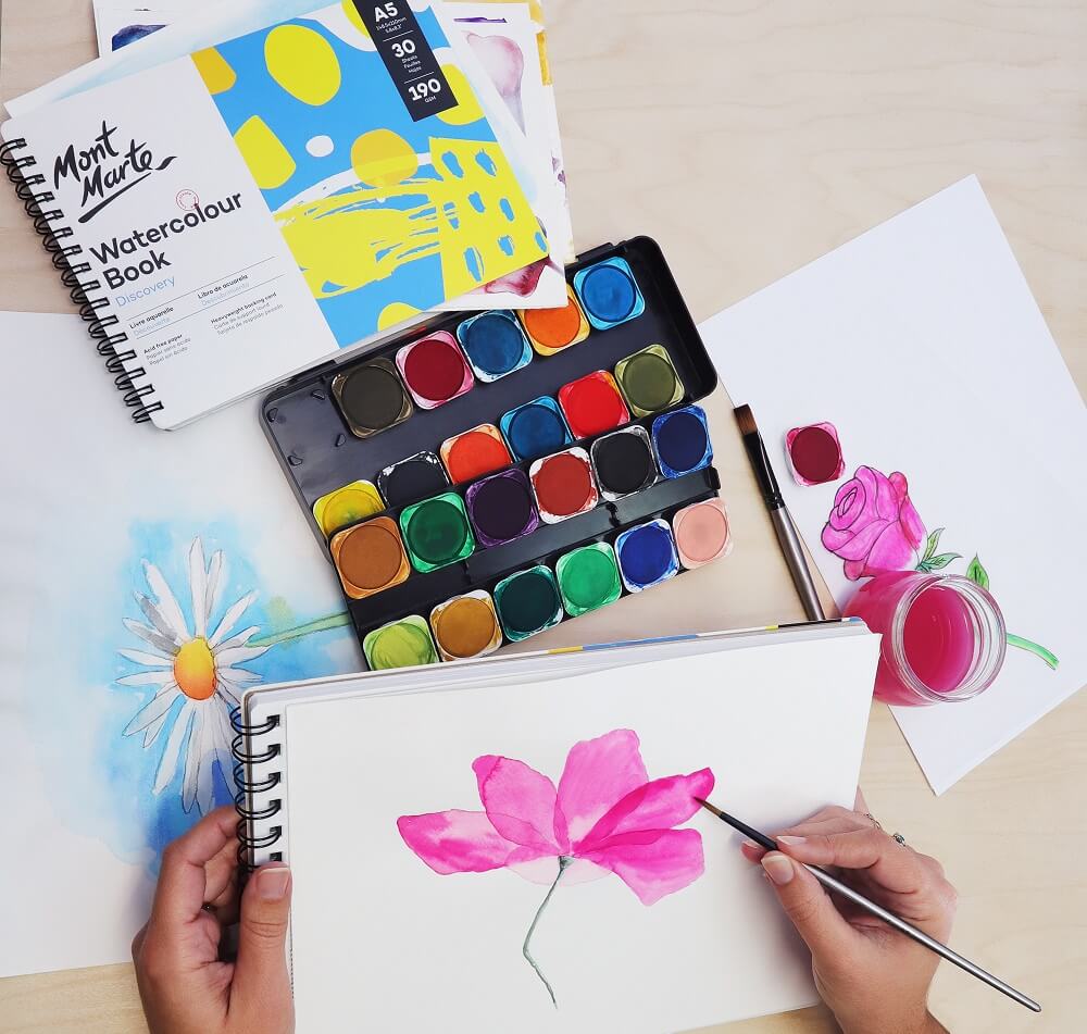

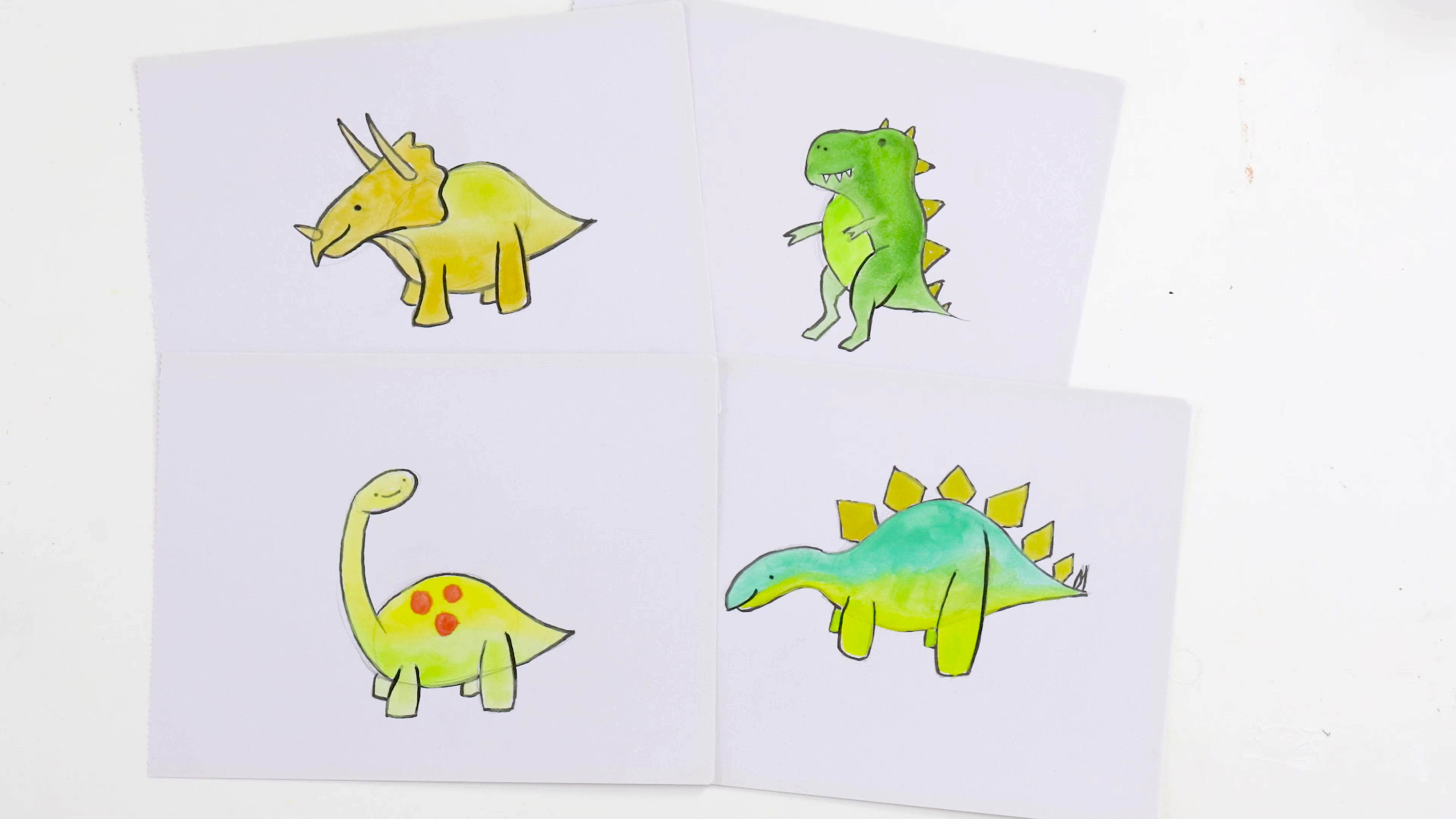


Picking paint colours is a fun part of creating, and although we’re here to give you some tips and tricks, you can create with any colour palette your heart desires. Different styles and subject matter lend themselves to certain hues, so it’s handy to know some core colour facts to help you choose. Read on to learn some colour basics so you can create with confidence!
1. What’s colour theory?

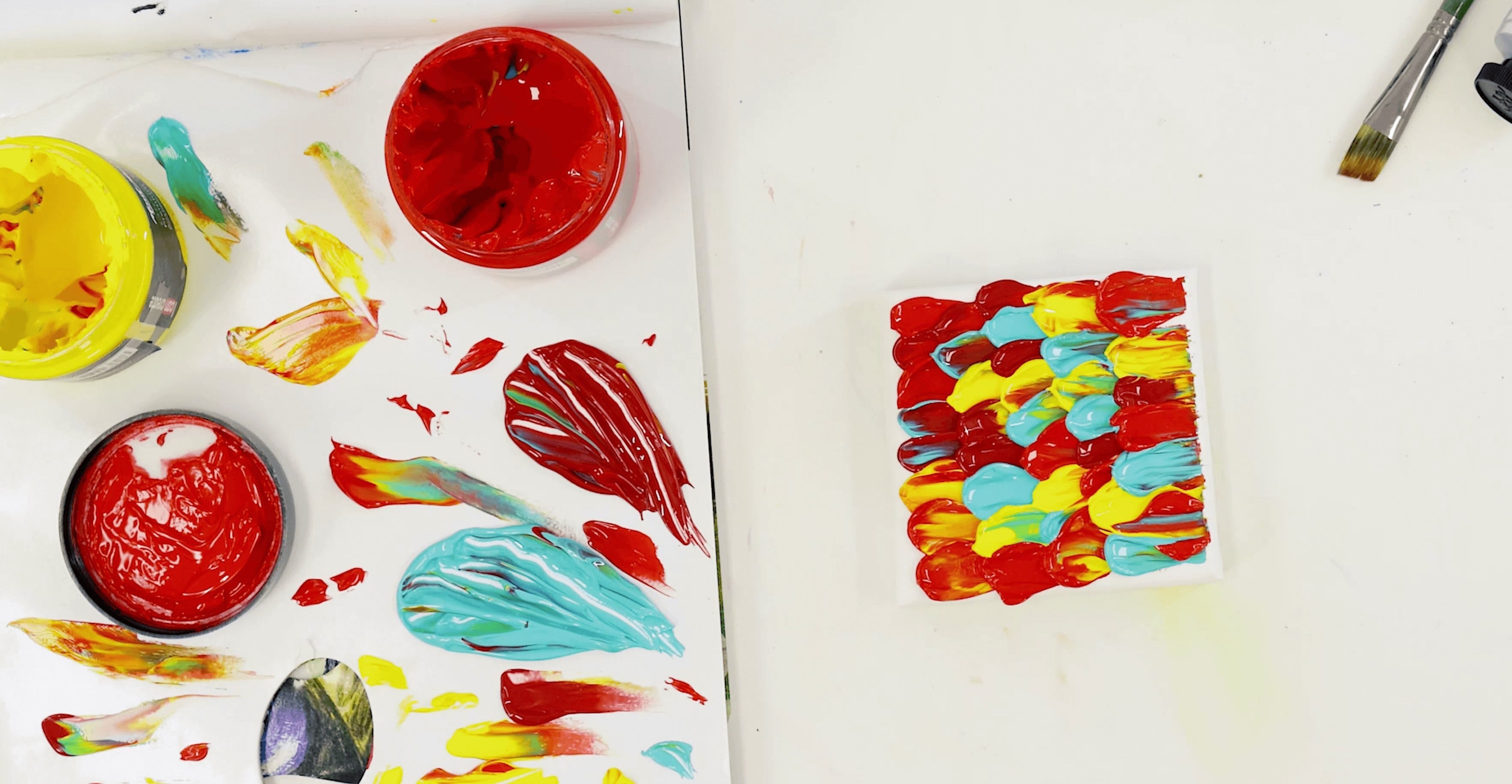
Art colour theory is all about which colours contrast and which have similar hues. Use colour theory when mixing colours and planning out your artwork to create harmony on the canvas or prompt particular feelings from viewers. While it’s handy to know how to make clean colours and control contrast, it’s up to you which colours go where.
Contrast can be created by placing opposing colours next to each other. You can even mix these colours together to make dynamic shadow tones. To understand more about which colours contrast and which are similar, it’s handy to use a colour wheel. We’ll dive into that in the next question, but feel free to read more in our colour theory and mixing tips blog.
2. How to use a colour wheel?

Colour theory is visualised with a colour wheel, which demonstrates colour contrast and harmony through each colour’s placement on the wheel. We have a Colour Dial you can use to work out how colours will mix before you get the paints out, so you don’t mix any unwanted colours.
Essentially a colour wheel groups similar colours together, ranging in cool to warm tones, placing contrasting shades opposite each other on the wheel. Most of us know the primary colours – red, blue, and yellow – but when you look at the wheel you can see they are the only pure, unmixed colours. These colours split the wheel into thirds, with three colours between each. The colours between each primary colour represent what happens when you mix them. Yellow and blue are split by shades of green; blue and red are split by shades of violet, and red and yellow are split by shades of orange.
Secondary and tertiary colours
You can then split each of the three mixed colours into secondary and tertiary colours. Secondary colours happen when two pure primary colours mix in equal parts to create a colour. The secondary colours include orange, green, and violet and they are found in the centre space between the two primary colours on the wheel.
Tertiary colours are made when inequal parts of two primary colours are mixed. One primary colour will dominate the mix, making it clear which one was mixed in a greater volume. For example, if you add more yellow than blue to a mix, the result will be yellow-green; if you add more blue than yellow, the result is blue-green.
The tertiary colours found on the colour wheel are:
- Yellow-green
- Blue-green
- Blue-violet
- Red-violet
- Red-orange
- Yellow-orange
Complementary colours
Colours with the strongest contrast are called complementary colours and they are the foundation of colour theory, composition, and mixing. There are three core complementary pairings: red/green, blue/orange, and yellow/purple. This couples each primary colour with the secondary colour it sits across from on the colour wheel. They’re literally opposite colours! Painting these colours close together will create a strong contrast, drawing the eye.
You can find a tertiary colour’s complement by seeing what’s across from it on the colour wheel. Yellow-green will contrast most strongly with red-violet, while blue-violet will contrast with yellow-orange.
There are also split-complementary colours which bring 3 colours into the grouping, rather than just two. Pick a colour on the colour wheel and look at its complement. Its split complement will be the two colours on either side of its direct complement. For example, yellow’s split-complementary colours are red-violet and blue-violet. This is a handy grouping to draw on to create varying levels of contrast so you can influence how the viewer’s eyes move across your piece.
Grouping colours
There are a few options you can experiment with when choosing colours to create harmony in your work. Try out triadic colour grouping by imagining there’s a triangle on the colour wheel. Use equal amounts of each colour at the points of the triangle in your work for a balanced, harmonised composition.
A tetradic grouping can be done the same way but by imagining a square instead of a triangle. The colours at each corner should be painted in equal quantities on your page to create compositional balance. Having said this, always remember to play with composition and see how changing colour volumes affects how you feel when you look at the painting.
For example, there are some well-known artists that have explored analogous colour groupings, where you primarily use 3-5 colours that are next to each other on the colour wheel. This creates a mostly monochromatic look for the painting, often used to stir emotions in the viewer. Some of Monet’s Water Lilies series use this technique, as does Picasso’s Blue Period. It doesn’t mean you don’t use any colours outside of your analogous grouping, but that the analogous group dominates your colour palette.
For more info on the colour wheel, mixing, and colour theory, check out our blog where we delve into why colour theory works in art.
3. Cool and warm colours – what’s the difference?

Now you know about colour theory, working out warm and cool tones becomes a lot simpler. Pure-pigmented colours are neither warm nor cool as they are neutral. They’re made by mixing neutral colours together in equal parts, such as true blue and true red. The resulting purple is neither warm nor cool.
Generally speaking, oranges, yellows, and varying combinations of red-yellow lean warm, while blues, purples, and red-blues are on the cooler side. Having said this, blue can be made to lean warmer, by adding a touch of red or orange. Likewise, when you mix a warm blue with a warm yellow, the resulting green colour will read warm – e.g., sap green!
Since blue hues somewhat underpin coolness, and red/yellow tones underpin warmth, you can learn to manipulate colour temperature fairly easily by playing with these tones. It helps to create a colour mixing chart so you can watch how the temperature changes as you combine your paints.
It’s important to remember colour temperature is subjective and you can have your own opinions about it. Our eyes see colours differently so it’s a bit of an interpretive process worth experimenting with.
4. How do you do colour matching?

Colour matching with paint is a skill that takes patience and practice, but it can be very rewarding to learn. Having a strong grasp of warm and cool colours helps, so you can make very slight changes to the temperature of colour while mixing.
You may have seen trending videos where people mix a paint colour to exactly match an object in their house – e.g., the skin of an avocado or a coloured toaster. Trends aside, it’s helpful to understand this process if you’re trying to realistically capture your subject matter.
Start by mixing the foundation of the colour you’re trying to match. If it’s a leaf, you’ll typically be mixing a green shade as your base. Add touches of yellow if you need a warmer shade, hints of blue to cool it, and varying amounts of white and black to level out the colour’s tone. Add small amounts of red to neutralise the green as needed.
You will likely add more subtle shades, such as a cool violet to change the colour and temperature of the green. The key is mixing in tiny amounts of colour at a time so that the change is gradual and easy to monitor. Brush some colour near your subject matter so you can track your progress and watch as it gets closer and closer to a perfect match.
The end goal is to be able to spread your colour onto the subject and have an indistinguishable match where you cannot tell where the paint ends, and the subject starts.
5. How do seasonal colours differ?

Seasonal colour groupings try to capture the way light and temperature naturally effect colours as the seasons change. It’s also a big trend in fashion to dress according to which season suits your skin tone and complexion, complementing your natural undertones.
Seasons are generally grouped into the following colours types:
- Spring: warm and light colours such as peachy pink, melon green, and custard yellow
- Summer: light and cool colours such as lilac, sky blue, and pastel pink
- Autumn: dark and warm colours such as mustard, raw sienna, and sap green
- Winter: dark and cool colours such as deep turquoise, pthalo blue, and crimson
Understanding seasonal colours is useful when you’re capturing subject matter that’s out in the elements. If you want to create a cold feeling, stick to deep cool colours, or if you’re going for springtime, lean light and warm.
It’s important to remember that certain times of day, like sunset, do affect colours and temperature, generally bringing warmth to your palette no matter the season. A cooler season may just have less warmth, with a more subdued sunset. To see some of these colours and techniques in action, have a look at the artworks in our 19 Winter Scene Ideas to Try blog.
6. How to make shadow colours?

Now you know about complementary colours, mixing shadow colours is straightforward. If the shadow falls on the subject matter, just take the base colour and add a tiny bit of its complement to it. For example, if you’re painting a lemon partially in shadow, mix a little bit of violet into your lemon colour to deepen the tone and blend into your shadowed areas.
If you’re painting a shadow cast by the subject matter, the lighting and temperature of the reference will affect the colour. If the reference setting is warm, the shadow tone should be somewhat warm as well, but if it’s cool, the shadow should lean bluer. It’s tempting to just grab a grey or black, but if you’re dabbling in realism, it’s best to mix a shade yourself. Think of it like colour matching!
Shadows are not usually pure black; they often have the undertone of what the shadow is being cast onto. If it’s grass, the shadow is going to be a deep green, with a cool tone to it. Shadows usually are more neutral-cool in tone, particularly compared to the rest of the subject matter. So, the basic steps are to deepen your subject matter colour, neutralise it, and add a little bit of blue to cool the tone.
7. What’s colour realism?
It’s basically just mixing and painting with colours that are accurate to your subject matter. You’re trying to match the colours as closely as possible, so it seems realistic and believable for the setting. Colour matching comes in handy when painting realism pieces.
8. Tell me about abstract colours?

Abstract art doesn’t follow the rules and doesn’t mimic the real colours of a setting, subject matter, or reference. It usually involves lines, shapes, and patterns, with unpredictable compositions. The colours can appear random, but they’re often balanced or placed in a certain way to create a visual journey or feeling for viewers.
A great example of this can be seen with Cubism colours, which are strategically placed to create the impression of a person, place, or object without strong outlines. Check out the style and learn how to paint it in our how-to video.
Colours can be abstract in different types of art styles, such as surrealism, which takes realistic subject matter and distorts it. You can enhance surrealism by using colours that aren’t found naturally in the setting, disrupting the realism of the piece.
9. How to pick paint colours?

Now for the big question: how do you pick paint colours? The truth is, there isn’t one straight answer when it comes to picking paint colours. There are lots of factors that affect colour choice, and it’s not a one-solution-fits-all scenario. For example, we’d give the opposite advice to a realist painter than an abstract painter, as they have very different goals.
If you’re going for warm subject matter, stock up on yellows, oranges and reds. If you’re painting shadows, keep complementary colours on hand. If you’re capturing a wintery city, grab some dark, cool tones.
It’s important to know the theory behind colours so you know how to use them, but ultimately you can mix any colours you want for your artwork! The best advice we have is to play and experiment with paint to see how you can create any colour you want. Make some colour charts and gradients and explore colour with no restrictions.
Now you know some facts and tips about colour theory, blending colours, and the importance of undertones, we hope you feel ready to pick paint colours with confidence!
If you’re feeling inspired, why not start a new art project, go back to an old one, or have a go mixing different colours at home? Maybe you can colour-match something in your room for fun.
If you do get creating, #montmarteart or tag us @montmarteart on Instagram or Facebook. We want to see what you come up with!
Want more? Check out our Projects and How-to’s for some inspiration. If you’re chasing more answers to burning art questions, get reading in our FAQs collection.


