
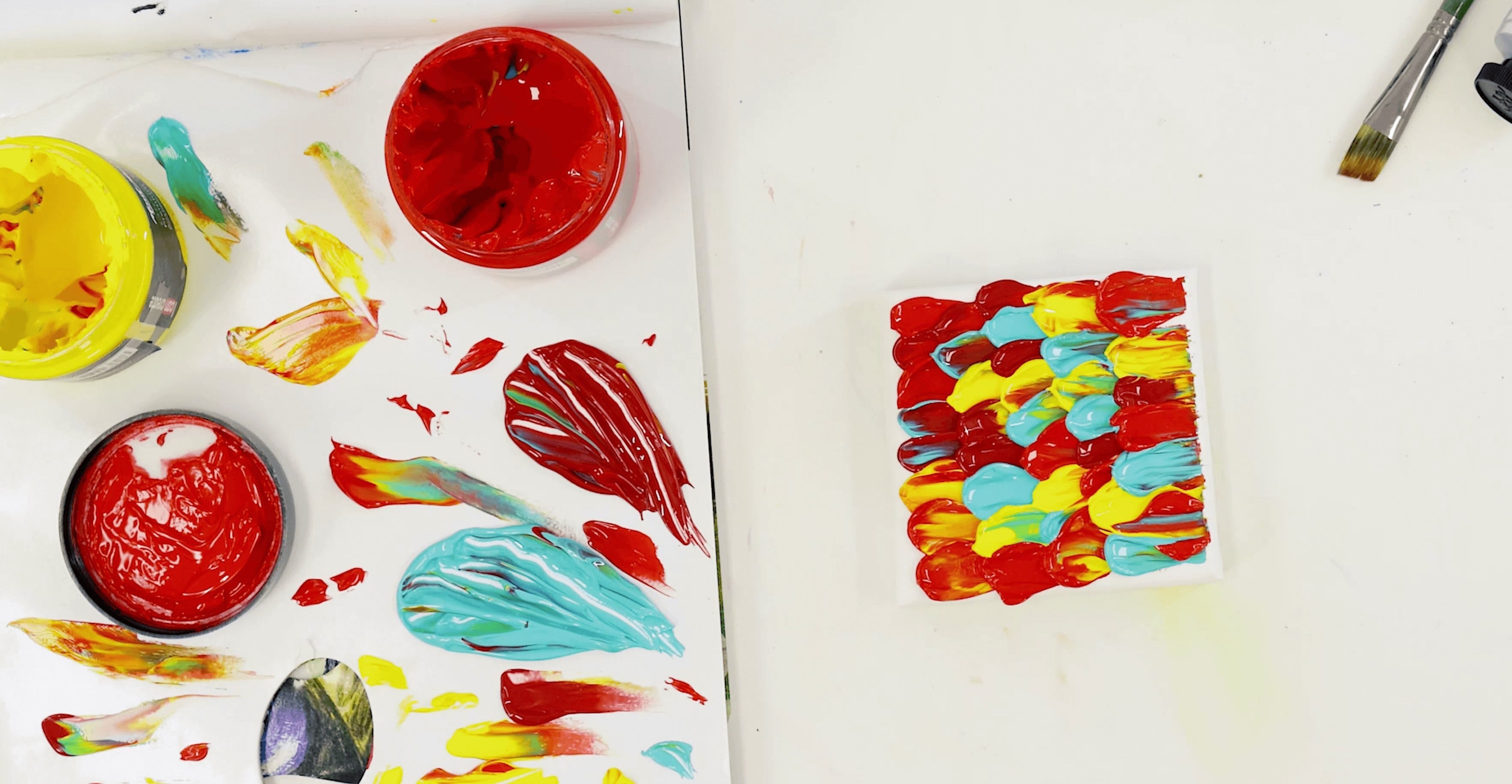


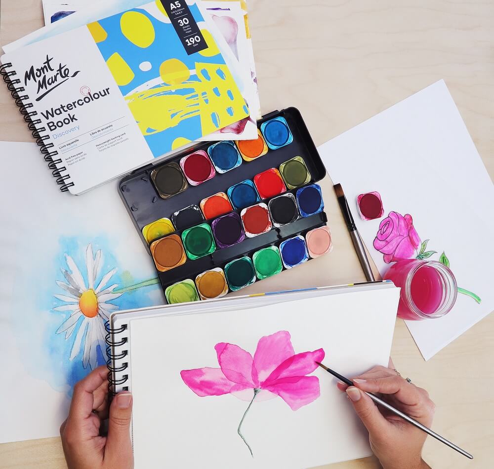


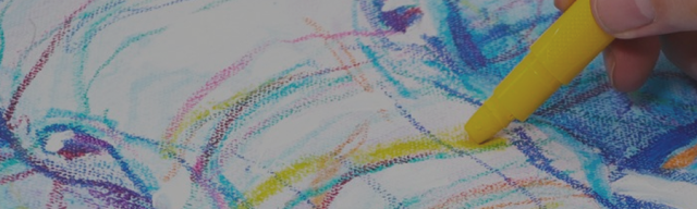
Next to composition, colour theory is one of the most important fundamental elements in painting. Not only do well selected colours create harmony in a painting, they can also evoke certain psychological effects on the viewer. Colour mixing clean, vibrant hues is a skill that should be followed. Creating authentic colours can give a painting real credibility. So, a little colour theory really can take your art to new heights. Here are the basics…
Complimentary Colours
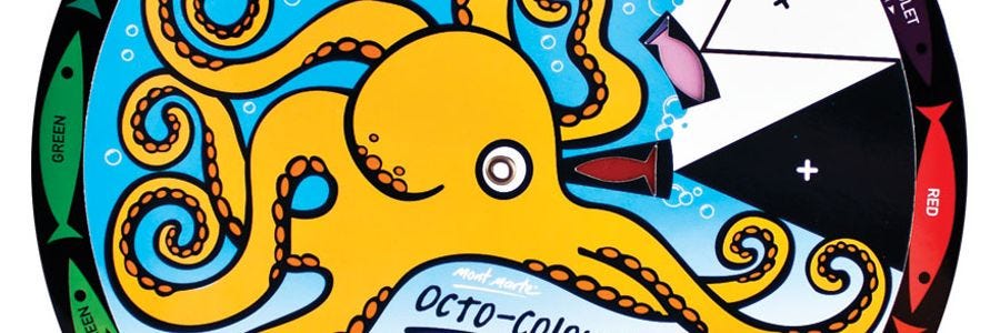
Complimentary colours are directly opposite on the Octo-Colour Wheel, for example, red and green or Blue and Orange. The complimentary colour phenomenon is a fantastic trick to use with your art work, when the two colours are used together they look incredibly vibrant and really pop. Another way complimentary colours can be used is for tinting a colour! For example if you wish to darken green you can add a touch of red and it will darken the green and but it will keep the colour clean.
Split Complimentary
Split complimentary is similar in hue balance to the complimentary except with three colours. Choose a main colour and the other two complimentary colours are below on either side of the exact opposite colour on the Octo-Colour Wheel.
Triadic
The Triadic colour grouping is a grouping of three colours that harmonize well together. The Triadic colours link up by a triangle on the Octo-Colour Wheel. I think this grouping works best when then the colours occupy the same amount of space in the artwork.
Tetradic
Just as the Triadic grouping features 3 colours, the Tetradic grouping has 4 colours and is used in the same way. This grouping is denoted by the colours falling in a square pattern equally spaced apart. If the colours occupy a similar amount of space in the artwork, the work will be compositionally balanced as well as harmonious in colour.
Analogous
Analogous basically means using colours next to each other. You can use from 3 to 5 colours. These colour groupings are used in warm and cool spectrums and due to the subtleness between adjacent colours, means the analogous colour groupings can impart real emotion in a work.
View the related video here
Check out our Octo-Colour Wheel


