

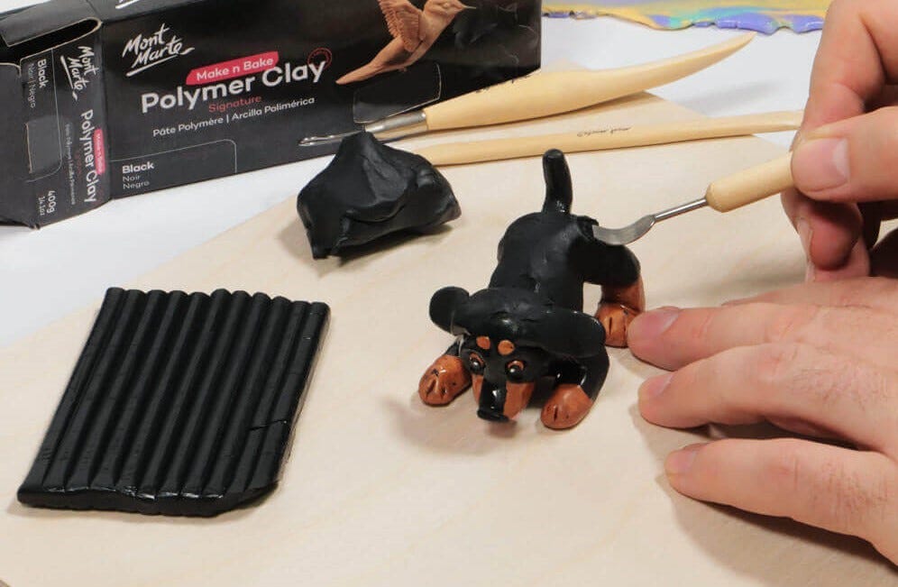


When it comes to art and composition, it can all feel a bit mysterious, like something you just “have an eye for”. But there are tools and ideas you can lean on to make your artwork feel more intentional, balanced, and easy to read. Here are some common questions about composition, so you can tackle your next project with confidence.
1. What is art composition and why does it matter?

Composition is simply how you arrange elements in your artwork, be it shapes, figures, light, shadow, colour, or space. It’s the plan that guides a viewer’s eye around the piece.
A strong composition helps to:
- Make the subject clear
- Create mood and energy
- Stop the viewer’s eye drifting off the page
You can think of it as stage directing: you’re telling each element where to stand, how loud to speak, and when the spotlight hits.
2. What’s a focal point and how do I choose a strong one?

Your focal point is the area you want people to notice first. To make it stand out, you can use:
- Contrast – bright light against deep dark, oppositional colours, or sharp edges against soft ones
- Detail – more texture or information in one spot
- Colour – a pop of saturated colour in a mostly muted scene
- Placement – slightly off-centre rather than dead in the middle
Ask yourself: if someone looked for two seconds, what would they remember? If the answer isn’t clear, you may need to simplify the surrounding areas or boost contrast around your chosen focal point.
3. What is the rule of thirds, and do I have to use it?

The rule of thirds divides your canvas into thirds horizontally and vertically. Placing key elements (like a horizon line or focal point) along these lines or where they cross can create a more dynamic, natural feel than putting everything bang in the centre.
In the outback painting above, the tree focal point lines up with the first vertical 1/3 line, and the horizon lines up with the first horizontal 1/3 line. This helps create a clear visual pathway and strong sense of balance.
Is it a must? Not at all. It’s more like a useful shortcut when you’re unsure where to place things. Once you understand it, you can bend or ignore it when the piece calls for something different (e.g., a perfectly centred portrait may create a calm, formal mood).
4. What is asymmetrical balance in art?

Asymmetrical balance is when the two sides of your artwork aren’t mirror images, but they still feel evenly weighted. Instead of matching shapes on both sides, you balance different elements using:
- Size – one large shape can balance several smaller ones
- Value and colour – a small dark or bright area can balance a bigger, softer one
- Detail – a detailed object can balance a simpler, larger shape
Asymmetrical balance often feels more natural and dynamic than perfect symmetry. To check it, squint or flip your image (or a photo of it) – if one side feels like it’s “tipping” visually, you might need to add or soften something to even it out.
5. What are leading lines and how do I use them?

Leading lines are any lines (actual or implied) that guide the viewer’s eye through your artwork.
They could be:
- A road or river
- The angle of someone’s arm
- The edge of a table or building
- Repeated shapes or highlights
You can use them to:
- Direct attention towards your focal point
- Create a sense of depth or movement
- Connect different parts of the scene
Be careful they don’t accidentally lead the eye off the page… try to let them curve or point back into the composition.
6. My artwork looks cluttered… how come?

If your piece feels busy or chaotic, you might have:
- Too many focal points
- Too much equal detail everywhere (how does the eye know where to go?)
- No clear big shapes
A few ways to calm things down:
- Group shapes – think in larger blocks of light and dark rather than lots of tiny details
- Use negative space – allow some quiet, empty areas for the eye to rest
- Soften or blur less important areas – keep sharper edges and contrast near your focal point
- Limit your palette – fewer colours can instantly make things feel more organised
Before you start a finished piece, quick thumbnails (small sketches of your piece to test composition) can help you try out different layouts without committing hours of work.
7. What is an “art tangent” and why do they make my work look off?

A tangent is where two shapes or lines awkwardly touch or almost touch in a way that flattens the image or distracts the eye.
Common examples:
- A character’s head exactly touching the edge of the canvas
- A tree line sitting exactly on a horizon
- Two shapes just kissing at one point, merging into one strange shape
Tangents can make depth unclear and pull focus away from your focal point. The fix is usually simple: nudge one element up, down, forward, or back so the overlap feels intentional rather than accidental.
8. How do art values (lights and darks) change composition?

You can think of value as the backbone of composition. Even if you removed all colour, a good arrangement of lights and darks will still read clearly.
To use value well:
- Decide where your highest contrast will be – this is often your focal point
- Keep some areas mid-value and quieter so the eye has somewhere to rest
- Check your piece in greyscale (a quick phone filter works) – if everything is similar in value, the image may feel flat
Planning a simple three-value study (light, mid, dark) before diving into full colour can make the final piece much easier to tackle.
9. Can I fix composition after I’ve already started?

Often, yes. A few rescue tactics:
- Adjust edges – extend or crop the canvas, or “frame” the piece with a border (physical or painted) or vignette
- Shift focus with contrast – darken or lighten areas to push attention towards your focal point
- Simplify – glaze, soften, or paint over distracting details
- Add small elements – a figure, a highlight, or a shadow can balance an empty corner or redirect the eye
If a piece really isn’t working, use it as a learning tool by marking up a print or photo of it and redrawing the composition as thumbnails. You’ll carry that knowledge into your next painting!
Composition isn’t about following strict rules. It’s about understanding how the eye moves and how you can gently guide it. The more you experiment with small studies, quick sketches, and alternative crops, the more natural it will start to feel.
If you sketch or paint something at home, #montmarteart or tag us @montmarteart on Instagram or Facebook. We’d love to see your take on composition!
Stay up to date with the latest Mont Marte news, info, products, projects, and more by subscribing to Creative Connection down below. Simply enter your email to get loads of free art lessons and inspo sent straight to your inbox.


