


If you’re feeling confident with the basics and ready to explore advanced art, this one's for you. Whether you're interested in mastering texture, experimenting with colour theory, or exploring multi-step techniques, these FAQs will help take your artwork to the next level.
1. What is glazing in art and how do I do it?

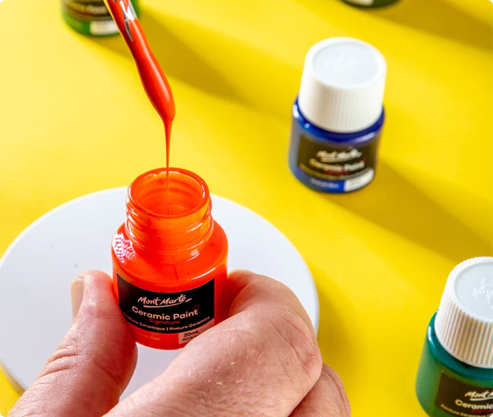
Glazing is a when you build up transparent layers of paint to create depth, subtle colour shifts, and a luminous finish. It’s typically used in oil or acrylic painting.
To try it yourself, you’ll need a glazing medium (Oil Medium for oils and a Acrylic Gloss or Matte Medium for acrylics) and paint. Mix a small amount of paint with your medium, then brush it over a dry layer of paint. Each glaze should be thin, and you should still see the colours underneath showing through. Let each layer dry before adding the next.
It’s a slow process, but the results are rich and complex, which is usually a great addition to realism pieces! If you’re using acrylics, you can even experiment with thinning your paints with water for a different kind of glazing effect.
2. What’ the secret for painting realistic skin tones?

Getting skin tones right is tricky – even for experienced artists. It’s all about layering and paying attention to undertones.
Start with a mix of red, yellow, and blue to make a neutral base, and then adjust from there. For warm skin, add more red or yellow. For cooler tones, a touch of blue or green can help. Add white to lighten and burnt umber or blue to darken.
Avoid the temptation to use straight white or black for highlights and shadows, using warm or cool tones instead to keep the colour natural and lifelike. And don’t be afraid to include unexpected colours like violet, green, or orange to reflect lighting and add vibrancy.
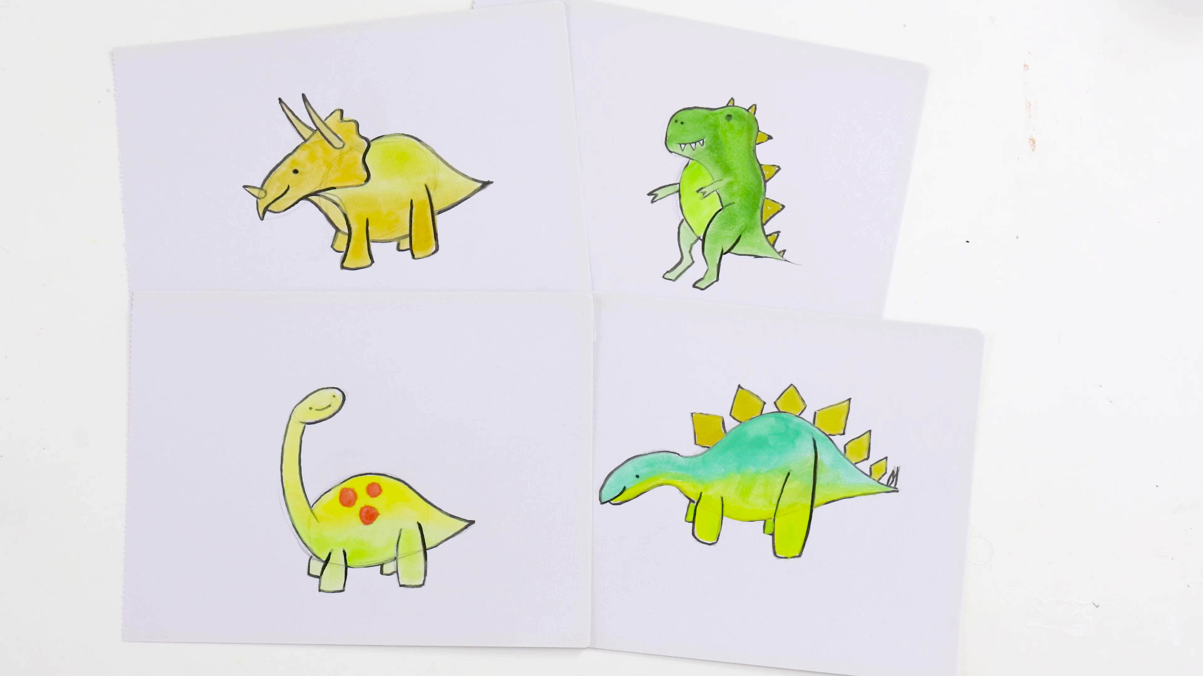
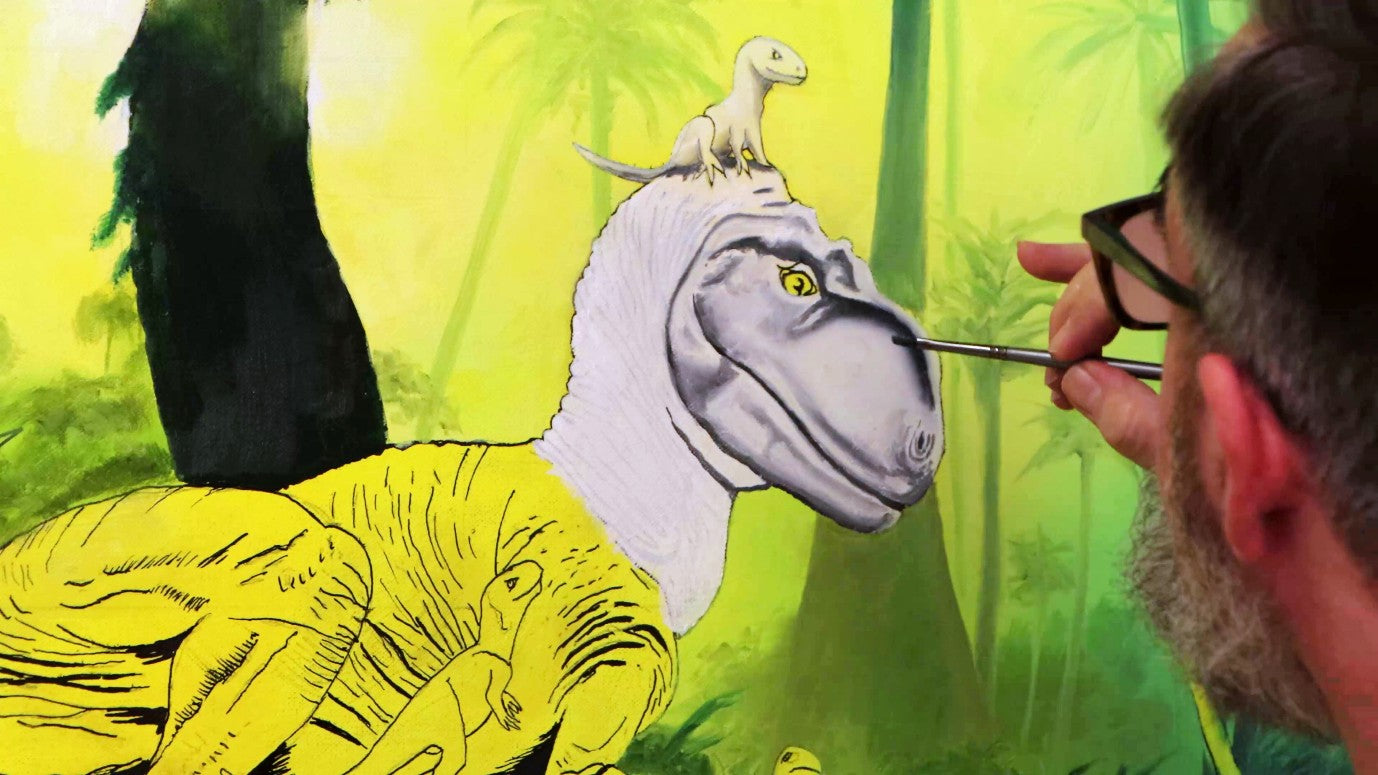
3. What is grisaille, and why use it?

Grisaille (pronounced gri-zai) is a kind of painting done entirely in shades of grey to build up values before adding colour. It’s a great way to focus on light and shadow without worrying about colour mixing.
You’ll usually start with a monochrome underpainting using black, white, and grey. Once that layer is dry, you can glaze over it with transparent colours. The result is a painting with strong structure and beautiful depth.
This is a fantastic technique to try if you’ve been working mostly in colour and want to sharpen your understanding of contrast and form. Check out the effect this technique had on our Dinosaur Painting!
4. What is chiaroscuro, and how do I use it in my work?

Chiaroscuro (Italian for “light-dark”) is a dramatic shading technique used to make things look three-dimensional by contrasting strong light and deep shadow. Think Rembrandt portraits or dramatic still life paintings – it’s all about spotlighting your subject and making them the focus.
To give it a go, start with a dark-toned background and build up your highlights gradually using white or a light version of your base colour. This technique works brilliantly in charcoal, graphite, or acrylics. You can apply it to portraits, figures, or even everyday objects to create that theatrical, moody look.
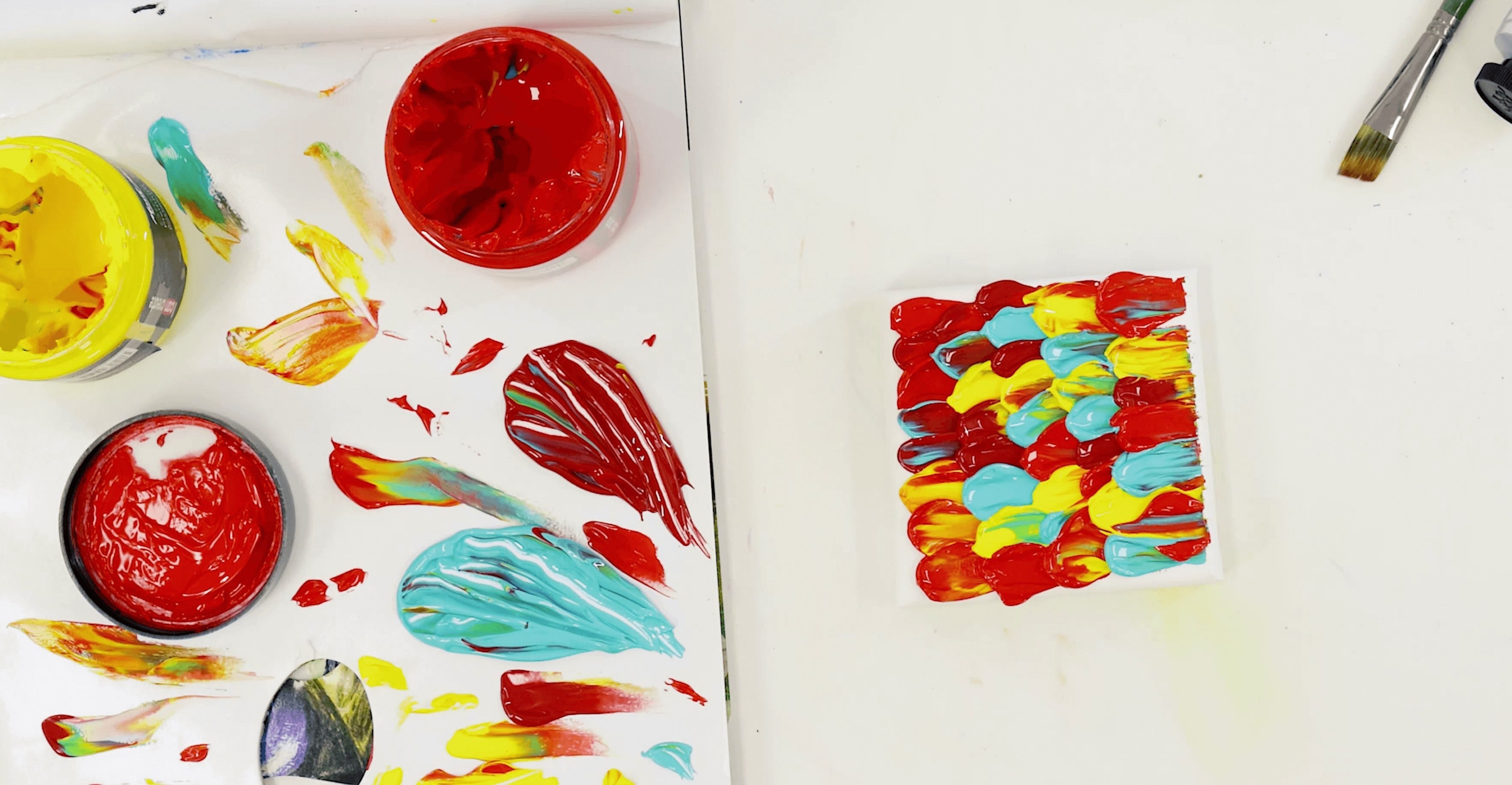
5. What is pointillism, and how do I try it without spending forever on it?

Pointillism is a painting technique where tiny dots of colour are placed close together to form an image. It was made famous by Georges Seurat in the 19th century and is surprisingly meditative once you get into the rhythm.
Instead of mixing colours on your palette, you place them side by side and let your eyes do the mixing. For example, dotting blue and yellow next to each other gives the illusion of green when viewed at a distance – cool, hey?
Use a small brush or even a cotton bud to dot your paint onto the surface. Try starting with a small study of a flower or simple still life to get a feel for the technique – it’s great for learning patience and colour interaction. Even though some of the classics have very fine, low contrast dots, you can put your own spin on it! Check out how we made the painting above in our Techniques tutorial.
6. How to make acrylic paint look like oil?

If you love that rich, buttery oil paint look but not the weeks of drying time, slow-drying acrylic mediums are going to be your new best friend.
Simply mix Acrylic Retarder with your favourite acrylic paints to extend their drying time so you can blend like you would with oils. Even though they dry slower, it’s not going to take weeks, we promise.
Level up the experience by mixing in Impasto to thicken the paint and give it that creamy, luscious texture. You can even top it all off with Gloss Medium to increase the shine when dry.
With a bit of practice and the right products, you can get depth and richness pretty similar to oils while still enjoying all the perks of faster-drying, easy-to-clean acrylics.
Advanced art techniques might sound intimidating at first, but once you start breaking them down, they become much more approachable. Whether you’re building contrast with chiaroscuro, dotting your way into pointillism, or gliding into the world of glazing, the key is to be curious and experiment freely.
Start small, try one technique at a time, and don’t worry if it takes a few attempts to get the hang of it. You’ve got the skills – you just need the practice. If you do get creating, #montmarteart or tag us @montmarteart on Instagram or Facebook. We’re excited to see what you come up with!
Stay up to date with the latest Mont Marte news, info, products, projects, and more by subscribing to Creative Connection down below. Simply enter your email to get loads of free art lessons and inspo sent straight to your inbox.

