


Need some colour mixing tips and answers? Maybe you're trying to mix the perfect peach or wondering why your colours are looking a bit muddy… we’ve been there! Colour mixing can be both relaxing and frustrating all at the same time. To help out, we’ve rounded up some common colour mixing questions (and answers) to help take the guesswork out it.
1. Why do I keep getting muddy colours?

The usual suspect? Mixing too many colours together or combining colours that don’t work well as a pair. Try limiting yourself to just two colours and use a clean palette or brush when mixing.
Complementary colours (like red and green or blue and orange) can cancel each other out and create browns or greys if you're not careful, so go slow and test on scrap paper first. If in doubt, mix a tiny amount at a time rather than diving in with a big blob.
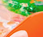
2. How do I make skin colour paint?

Start with a base of white, a touch of red, and a tiny bit of yellow and blue. From there, tweak based on the undertone you’re after:
- Want a warmer tone? Add more yellow or red.
- Want it cooler? Try a dash more blue.
It really helps to make a little swatch card as you go and note down your favourite mixes. That way, the next time you find the perfect shade, you’ll actually remember how you got there.
3. Limited colour palette… what is it and why would I use it?

A limited palette means using just a few core colours to mix everything else. For example: one red, one yellow, one blue, plus white (and sometimes a neutral like burnt umber).
It might sound restrictive, but it actually:
- Keeps your artwork looking cohesive
- Helps you learn how your paints behave
- Stops you buying 47 tubes to make a start
It’s a great way to build confidence and skill without feeling overwhelmed by too many choices.
4. And how about unified colour palette? How do I do that?

A unified palette is when all the colours in your artwork feel like they belong together. One easy trick is to mix a tiny bit of the same colour into almost every tone you use – for example, a touch of lilac or a neutral like raw umber.
That shared colour ties the whole piece together, a bit like adding the same seasoning to every ingredient in a recipe. It may not feel obvious to the untrained eye, but it makes the different subjects in your painting feel like they’re part of the same world. Plus, it’s a great hack for instantly changing the time of day in your artwork.
5. What is colour theory, anyway?

Colour theory sounds fancy, but it’s really just a set of ideas that explain how colours relate to each other and why certain combinations work (or clash).
At its core, colour theory covers things like:
- The colour wheel – primaries (red, yellow, blue), secondaries (green, orange, purple), and tertiaries (a mix of neighbouring primary and secondary colours)
- Colour relationships – complements (high contrast), analogues (low contrast), and warm/cool families
- Value and saturation – how light, dark, bright, or muted a colour is
You don’t have to memorise every rule. Think of colour theory as a cheat sheet: it helps you predict what will happen before you start mixing, so you spend less time fighting muddy mixes and more time painting. Once you know the basics, you can bend the “rules” to suit your style.
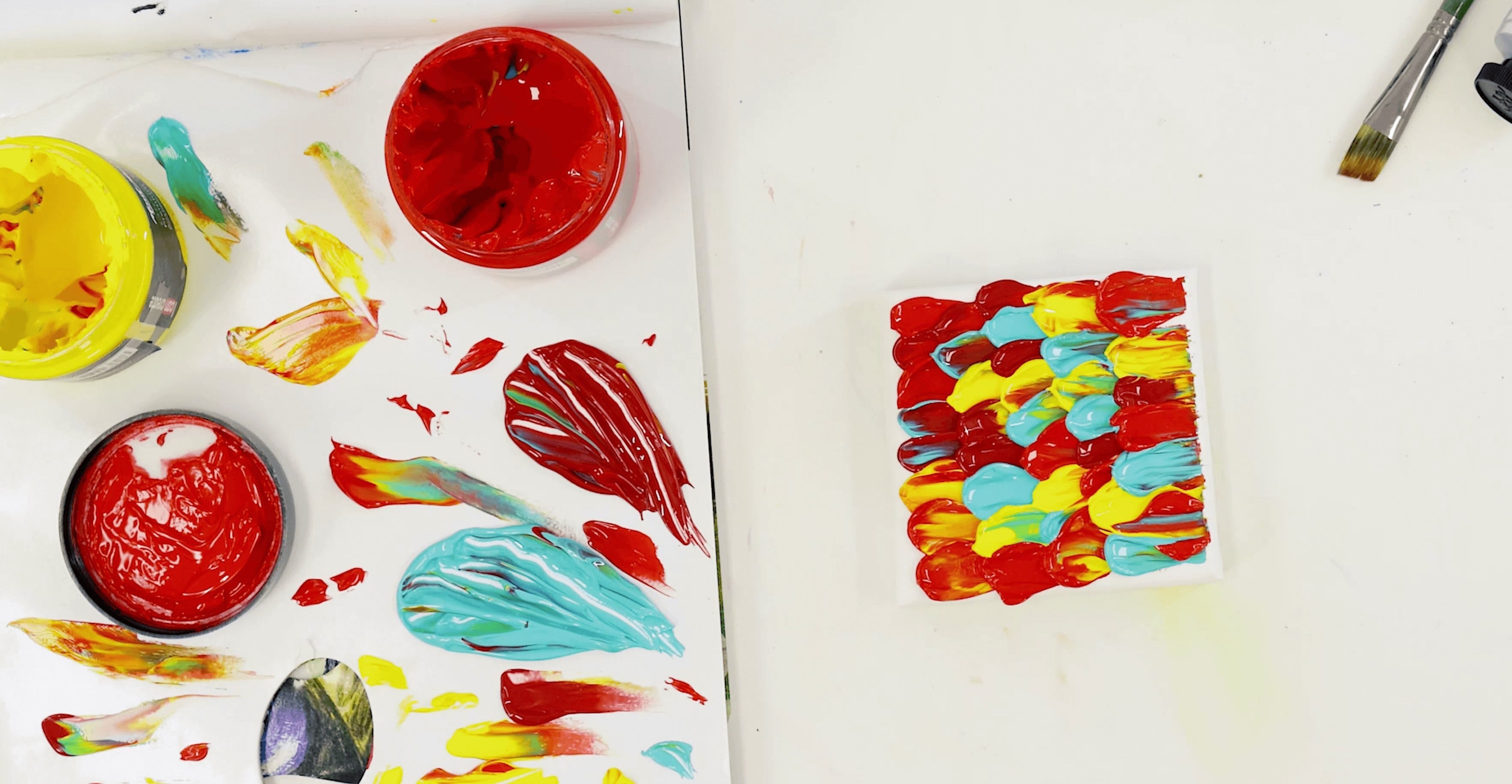
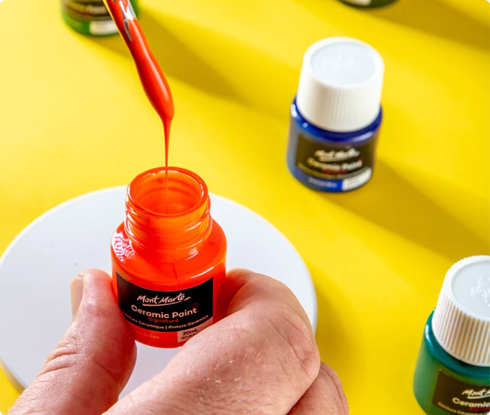
6. How to make a colour mixing chart?

This is so worth doing! A colour mixing chart is a simple grid where you swatch out how each colour on your palette mixes with every other one.
Doing so:
- Shows you which pairs make clean brights
- Reveals which combos turn neutral or muddy
- Becomes a personalised reference for future projects
It takes a bit of time to make, but it saves you so much guessing later on. Plus, it’s pretty meditative and relaxing to put together.
7. How do I know when to mix on the palette vs on the canvas?

Mix on your palette when you want a flat, even colour. This is great for backgrounds, blocks of colour, or graphic styles.
Mix on the canvas (often called optical mixing) when you want more energy and texture. This is ideal for creating broken colour, impressionistic marks, or layered glazes.
Neither way is “right” or “wrong” and lots of artists use both in the same piece. Have a go at both use whichever approach suits your style and vision.
Our biggest takeaway we want to leave you with is let colour mixing feel like play – it is pretty satisfying after all! The more you experiment, the more confident you’ll get. Just remember to keep your brush clean between mixes, swatch often, and don’t be afraid to try something unexpected.
If you do get creating at home, #montmarteart or tag us @montmarteart on Instagram or Facebook. We’re excited to see what y’all create!
Stay up to date with the latest Mont Marte news, info, products, projects, and more by subscribing to Creative Connection down below. Simply enter your email to get loads of free art lessons and inspo sent straight to your inbox.


