


Have you ever created a project, yet on viewing the work you felt there was something not quite right with it? You rendered it well, the colours chosen all complement each other, and the perspective looks right...so why hasn’t it worked? Despite the subject matter being good, in most cases this is due to the compositional side of the work not being successful.
What is Composition? Why is it Important?
Composition is basically the term used to describe how one arranges the visual elements in an artwork. Design elements such as line, shape, colour, value, texture and negative areas are all organised to best bring a harmonious vibe to the work. If all these elements are composed according to the principles of art and design, it can impart contrast, movement, rhythm and guide the viewer’s eyes to certain areas in the work. Using compositional theory also conveys the artist’s intent very effectively.
Henri Matisse defined composition in his ‘Notes of a Painter’ in this way: “Composition is the art of arranging in a decorative manner the diverse elements at the painter’s command to express his feelings.”
In all honesty a lot of the time we are already utilising compositional theories unknowingly, but, with a little more understanding, we can use these psychological compositional tricks to their full potential. Let's skim the surface of this complex topic with 10 compositional staples that will help guide you to creating a more harmonious artwork:
Balance
This is the easiest compositional theory to understand. An artwork with a symmetrical arrangement imparts a calming feel, whereas an unsymmetrical arrangement creates an uneasy feeling of discord to the viewer. The latter is particularly useful for artists who wish to evoke a sombre or dramatic feeling.
Unity
The best way to see if your work is united is to have a good look at your painting. Does anything look haphazard or ‘out of place’? Do all the elements tie in together? Be aware though, too much unity creates monotony, and too much variety creates an uneasy feeling so try to strike a happy medium.
Leading
Leading lines can be used to direct the viewer’s eyes to a crucial element in the painting, or to simply guide the viewer’s eye through the work in a specific way. If one sees a continuous line or shape the eye will follow it by default. This can be done by incorporating a road or fence in a certain direction. A leading line may also be suggested with a row of trees, clouds or rocks in a designated shape or direction.
Emphasis
In most artwork there is one important element that the work's success ultimately hinges on. The viewer’s eye really wants to rest on an element otherwise it wanders aimlessly. This can be achieved by emphasising this ‘element’ by placing it in the most noticeable part of the canvas, by forcing its perspective or by softening the surrounding negative space.
Contrast
Tonal strength is a very important technique to use when composing a work. A painting that features strong contrasting tones or colours, has a very different vibe to those containing subtle contrasts in light and dark. The contrast element extends to differing shapes and textures also. For example, thick white lines on a dark background, with a round red shape included, will immediately draw the viewer’s eye directly to it.
Pattern
I have found that creating a recurring regular set of shapes and lines adds a complex, intrinsically interesting look to a work. A complex pattern can hold a viewer’s attention for a long time. They don’t know why it interests them, they just have to keep looking at it.
Rhythm
Rhythm can be created by movement implied through a repetition of elements in a non-uniform but organised way. Unlike pattern, which demands consistency, rhythm relies on variety.
Perspective
Although perspective is a whole other visual element of its own, in terms of composition, it falls into the proportion category. This dictates how elements fit together and relate with one another. It clarifies the size and scale of elements, and whether they are nearby or distant. This works on abstract art as well as realism, and can really add drama to a work.
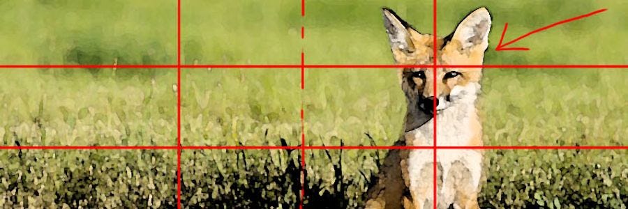
The Rule of Thirds
The rule of thirds is the easiest compositional rule to follow in a painting. The best way to explain how to use this compositional trick is to divide a canvas into thirds both horizontally and vertically. Place the focus of the painting either one third across or one third up or down the picture, or where the lines intersect. Applying the rule of thirds to a painting means you'll never have a painting that's split in half, either vertically or horizontally, nor one with the main focus right in the centre like a bull's-eye.
The Rule of Odds
Sometimes in art we need to battle with our brain and what it thinks we should do. What I mean is that by default we are inclined to balance things out. This does not happen in nature. For example; if we are painting a fruit tree, we can have a tendency to paint an equal amount of fruit (and all of the same size and evenly spaced). Having an even composition is boring to look at. When you compose an odd number of elements in a composition, your eye and brain can't pair them up or group them easily. This adds a certain je ne sais quoi.
So you can see fostering an understanding in regards to composition can be very beneficial for your art, and, I’d say it’s probably one of the most overlooked theoretical parts of the creative process. This could be due to it not being intuitive, its possible use considered intangible and/or, considered overly complex. While it is actually relatively easy to comprehend and utilize, the psychological influence that can be imparted into a work can be quite fascinating and it can really make the difference between a good painting and an excellent painting.
References:
Boddy Evans, M. (2017) The 8 Elements of Composition in Art, https://www.thoughtco.com, accessed 4th May 2017.


