


If you want to add a bold, vibrant, and eye-catching touch to your art, it’s time to learn how to use neon acrylic paint. Whether you’re creating statement pieces, adding highlights, lettering, or experimenting with bold designs, neon paint can create emphasis and draw the eye. But how do you use these vivid hues without getting lost in the fluoro-sauce?
If you’ve got some neon paint and aren’t sure where to start, here are six creative tips to help you make the most of your electric palette. Let’s light up your art!
1. Layering paint for maximum impact

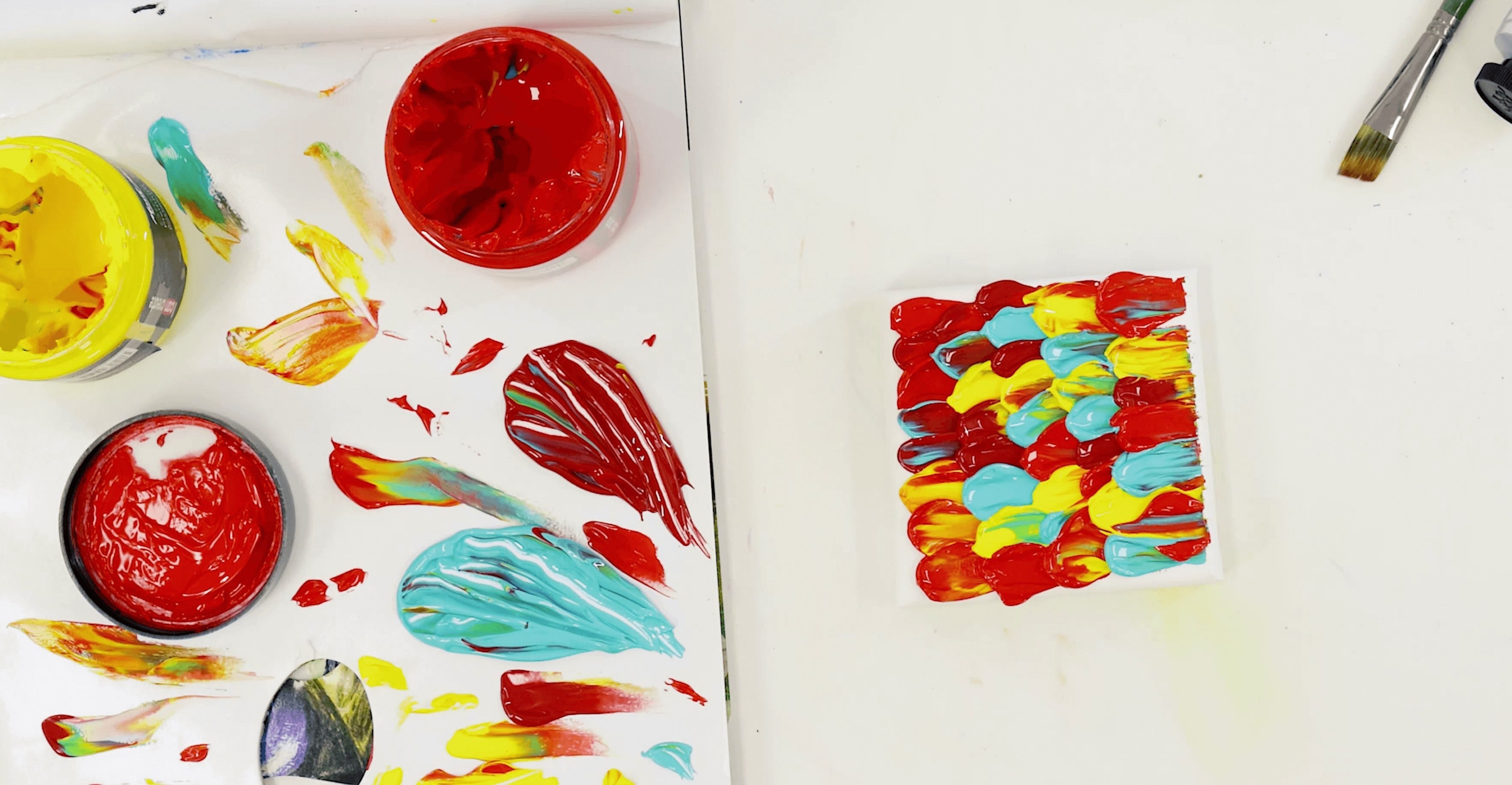
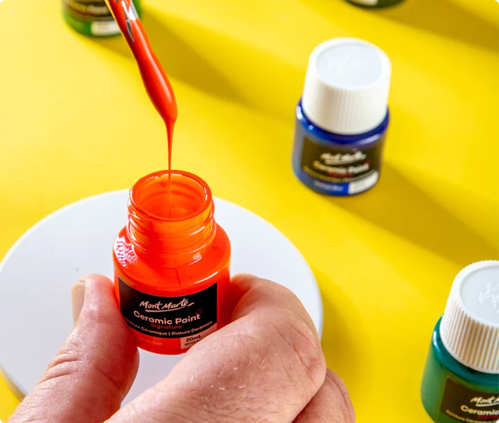
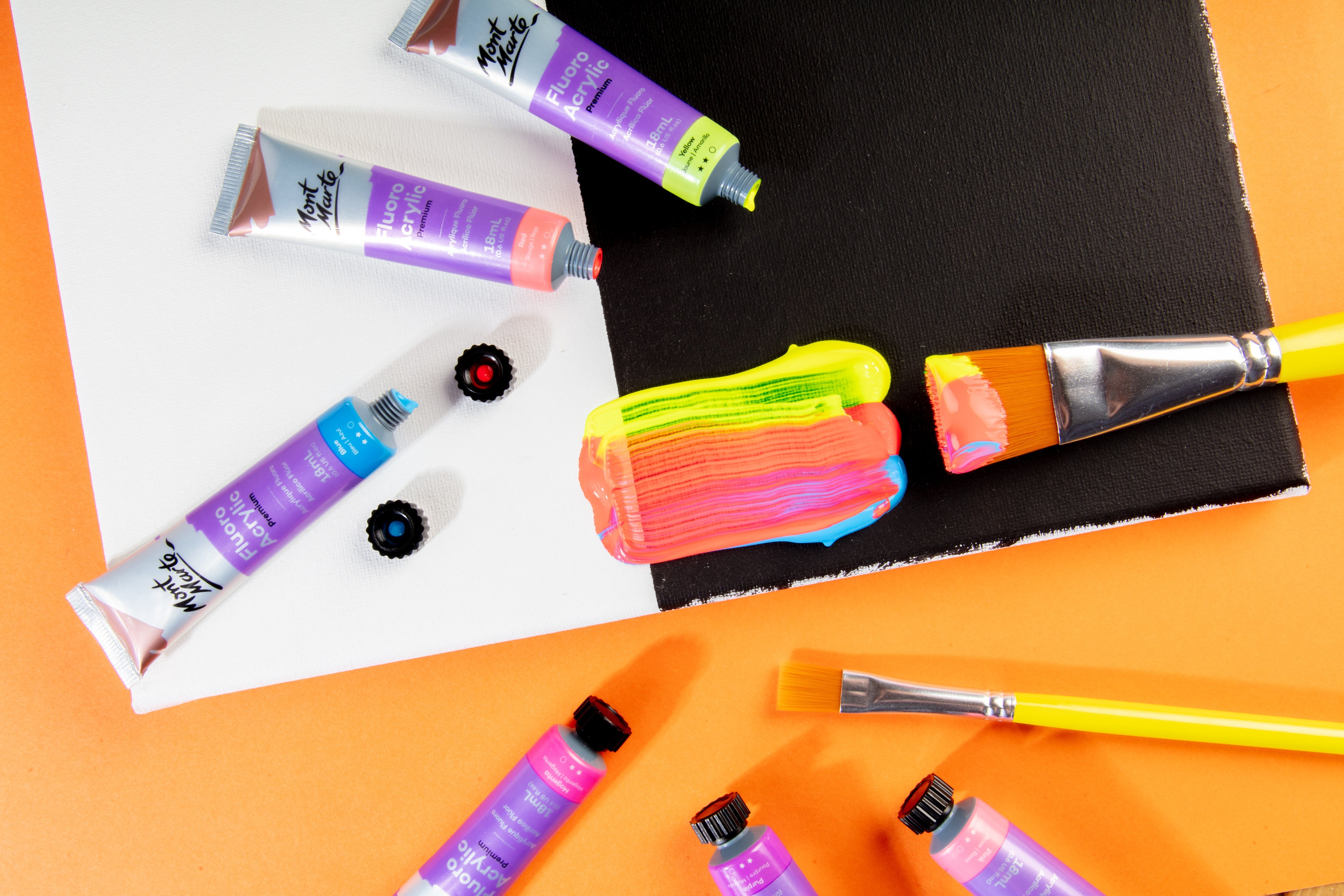
One of the biggest challenges with neon paint is getting that intense, vibrant look on your canvas. Straight from the tube, neon can sometimes appear a touch transparent, depending on the formula. The secret to making it pop? Layering.
Start with a solid white base coat—neon colours show up brightest against a light background. Apply your neon paint in thin, even layers, allowing each one to dry before adding the next. This helps build up the opacity and makes the final colour sing!
To get a super smooth finish, use a smooth, flat taklon brush for even coverage. For smaller details, like lettering or fine lines, a round detail brush works best. Don’t worry if the first coat looks a little lacklustre – that’s normal. Just keep layering until you’re happy with the vibrancy.
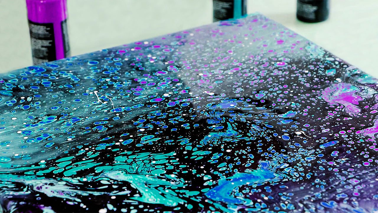
2. Using texture in art to bring out the glow

Neon paint doesn’t just have to be flat and smooth – texture can make the colours even more dynamic. Using textured surfaces or adding texture mediums can create depth and make the neon tones appear even brighter.
Try applying neon paint with a palette knife for defined, bold strokes, or experiment with adding Impasto to thicken the formula. Raised areas catch the light differently, making the fluoro colours look more dimensional.
You can also mix your paint with a touch of Gel Medium Gloss to add a subtle sheen, enhancing that inner-glow effect. If you’re going for a mixed media piece, layer fluoro paint on top of textured backgrounds for extra dynamic contrast.
3. Neon and neutrals

Neon paint can easily overwhelm a piece if used too liberally, so balance is key. One way to make your neon accents pop without overpowering the entire artwork is to pair them with neutral tones.
Black, grey, and white are some of your best friends when working with neon. Imagine a bold fluoro pink against a charcoal grey background or electric blue lines cutting through a monochromatic scene. This contrast makes the neon look even more vivid while giving the eye a place to rest.
For more subtle vibes, use muted earth tones to offset the intensity. Think of adding a neon green pattern to a beige backdrop or incorporating small neon highlights in an otherwise minimalistic piece.
4. Painting gradients for added dimension

Gradients are a great way to showcase fluoro paint’s vibrant qualities, and they’re surprisingly simple to create. Start by picking out two neon shades that blend well, like neon yellow and pink or blue and green.
Begin with the lightest shade, gradually blending into the darker hue using a soft brush or sponge. Move quickly while the paint is wet enough to blend smoothly. For a softer transition, mix a small amount of the two colours together where they meet.
You can also experiment with mixing fluoro and non-fluoro colours for a unique gradient effect. Think blending neon orange with a deep maroon or neon purple with a dusky lilac – it works well for sunset effects! This unexpected combination suits modern, eye-catching artwork.
5. Neon outlines and highlights to draw focus

Fluoro paint is naturally attention-grabbing, so why not use it to emphasise key areas of your artwork? Neon outlines around bold shapes or patterns make them pop, while a touch of neon in the centre of a design can serve as a focal point.
For abstract pieces, use neon paint to highlight geometric forms or to trace the edges of fluid shapes. If you’re working on a portrait, add neon accents to the hair, eyes, or accessories to create a contemporary twist.
One fun technique is to use neon paint sparingly as a “glow” effect—think of a neon aura around a silhouette or neon lines radiating from a central point. Use a fine liner brush for precision and keep your strokes consistent for a polished finish.
You can also use fluoro paints for neon-style lettering – check out our tutorial here.
6. Be daring and break ‘colour rules’

The beauty of fluoro colours is their unpredictability, so don’t hold back! Experiment with combining fluoros with unexpected tones like soft pastels or strong primaries, as varied contrast can create surprising combinations.
For example, pair neon yellow with dusty lavender or electric blue with sandy beige to add a twist to ocean scenery. These unusual pairings add a fresh, modern twist to your art and might just become your new fave combo.
Also, don’t shy away from pushing your comfort zone. Try splattering neon colours over a background painting or layering a fluoro pattern on a rustic, vintage piece. You might discover a new style that feels uniquely yours.
At the end of the day, neon paint is all about having fun and being bold—so don’t overthink it. Just dive in and see where your creativity takes you! So, grab your fluoro paints and let your imagination glow. With these few simple tips and a daring attitude, you’ll light up your next piece like never before.
If you do splash some fluoros around, let us know by tagging us on Instagram or Facebook @montmarteart or use #montmarteart. We’d love to see any neon art paintings you create!
To stay up-to-date with the latest projects, inspo, tips, and tricks, join our Creative Connection community by signing up down below.


