


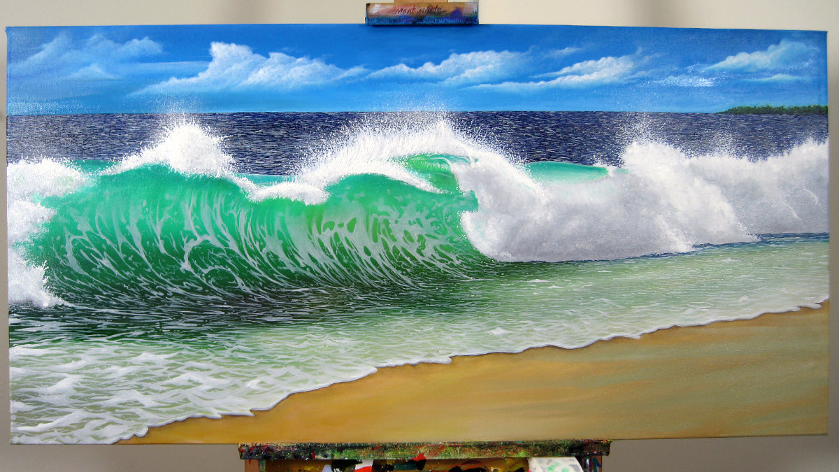
8 tips on how to paint a wave
We have made a list of handy tips to show you an easy way to paint waves for your next project. You too can capture moving water with art by following these handy hacks and ideas. We are tackling a typical breaking wave for reference, but these tips are applicable to most wave paintings. Read on to find out more 🧐
1. Understand waves

A good starting place is to understand the shape of a wave and how it fits into the ocean setting. We’ve got a list of things to look for and take note of when you start off your project:
- Even though a wave will rise and fall, the bottom stays level with the horizon as it's connected to the body of the ocean
- The curve of a wave is concave, meaning it creates a sort of C-shape facing towards the shoreline
- As a wave begins to break, it becomes more concave, bringing the top towards the bottom of the wave
- This creates white, foamy sea froth along the top edge of the wave and at the base as it spills over onto itself
- You can have rolling, transparent, or breaking waves, which have different colours and details to capture with paint
- When choosing your reference pic, take this into account as foamy breaking waves need far more white paint!
2. Ideal colours

To help you sort out your palette, we’ve compiled some of the best colours for painting a realistic sea painting. You may not need all of these colours, depending on the colours in your reference picture. Bear in mind, there is more to the ocean than just blue – let’s dive in and have a look!
Core colours:
- Ultramarine Blue, Pthalo Blue, and/or Prussian Blue
- Pthalo Green and/or Viridian Green
For highlights
- Titanium White
- Cadmium Yellow
For shadows
- Burnt sienna
Bear in mind when picking your medium that they may create slightly different results. For example, oil dries far slower than acrylic so you may need to wait a few days for the surface to dry before adding in finishing touches and finer details. Likewise, acrylic dries fast so you may need to work quickly to blend your highlights into your mid tones before it’s dry! Just pick the medium that you feel will make the project the most enjoyable for you.
3. Outline
It can help get you on the right track to start your painting by outlining the wave. Look at your reference picture and note where the tip of the wave starts to curve on itself. How big is the spill over compared to the rest of the wave? Draw it in proportion and be sure to lightly outline the foam along the spilling section so you know where your highlights go.
Take note of where the top of the wave dips and peaks so you have a rough outline of where the wave stands out against the background. You can do this outline lightly in pencil so it’s easy to cover up when painting!
4. Shadows & sunlight

Your dark tones and highlights won’t be basic black and white for this one! Sunlight passing through a wave creates yellow-toned highlights, which can be made by laying down a very light, creamy yellow and then blending the blue/green mid-tones into the highlight. This will create a glowing effect in the wave, drawing the eye to areas of the wave that are thinner or more exposed to the sun as it crashes.
Similarly, shadows will be deep, dimensional hues that are blended out with your mid-tones. This is best made by mixing burnt sienna with your blue colours. More blue creates a darker tone, and more Burnt Sienna creates a warmer colour. As you add these to your painting, think about how they will blend into our mid-tones and pay attention to which parts of your reference wave seem darker. Our goal is to capture the movement of the ocean which involves painting the deep sections and rising sections with shadows and highlights accordingly.
5. Paint in order

Paint your wave in tonal order, starting with highlights, moving to mid-tones, and ending with your darker shades. This makes sure your highlights stay bright and don’t get muddy as they are painted onto your blank painting surface rather than wet paint!
Your wave is likely to have strong highlights where the sunlight hits the water, creating bright transparency. Where the top of the wave begins to arc, creating the curve and the spillover, the light passes through the water more easily as it is less dense. This is a good place to begin, along with the sea foam edging spillover.
Your mid-tones come next, so border your highlights with the next lightest shades and blend their meeting point to create a smooth transition. This will likely be where the middle of the wave meets the sunlit section. It might also include the part of the wave spilling over, as it is being hit by sunlight and is a brighter water shade. Continue painting the mid-tones and base colour of your wave until you’re up to the shadows!
Last but not least are the darker tones which create depth at the base of the wave and add dimension to the curve. Your dark colours can be used to emphasise chop beneath the wave as well as highlight sections of water not in sunlight as it moves. Deeper tones can also be layered underneath the spillover to capture the shadow of the breaking wave. They are essential to nailing movement for realistic sea painting!
6. Maximise your colour palette

Other than the wave, you have a background and foreground to paint! In most cases, it will involve more ocean or maybe even sky. You may find that your existing mixed colours will help you finish off the remaining areas as they will likely involve varying shades of blue and green. Why not make the most out of your palette and use a combination of your mid and deeper tones for the ocean behind the wave and stretching beyond the curve? Waste not, want not!
7. Making movement

The movement of your wave can be captured not only by creating depth but also by adding froth details moving up the curve. Deepen your bright foam colour by adding a smidge of blue to it. This will create a more mid-tone version of the froth that you can create trails with, using gentle brush strokes from the foreground moving up the wave. Just paint the trails lightly and blend out to soften them as moving foam doesn’t usually have harsh edges.
This darker foam colour can also be used to add any chop highlights in the foreground and background. To make the movement believable, it helps to add some deeper shadow tones beneath the chop and foam trails, adding dimension to the details. This accentuates that the foam or chop is rising above the surface level, as you create depth with your shadow tones. Remember, your shadow tones are created by mixing your blue and orange colours to create a darker hue – just add more blue for a darker colour!
8. Realism details

Don’t be afraid to add in some finer details to really finish off the piece! This might be adding spray from the foam around the crashing wave, lines of sunlight across the top of the spillover, or detailing the edges of your highlights so they have frayed texture. Just have a good look at your reference picture and try to recreate the little details with finer brushstrokes. Adding these final touches can really level up the realism!
Now that you know these handy tips for painting simple waves, you’re set to have a go and try it out for yourself! 😊 We also stock some great mediums and varnishes to add gloss and shine to your ocean project so why not check them out?
We hope that you feel inspired to pick up some paints and have a go at these easy ways to paint waves. We’ve also got some past projects that tackle wave painting in different ways so you can find the right fit for you.
If you do, #montmarteart or tag us @montmarteart on Instagram or Facebook. We’d love to see what you create!
Looking for more? Check out our Artist Gallery for some inspiration. If you need supplies or want to experiment with one of the techniques mentioned, jump online to check out our paints and canvases.


