


Still life painting with reflective surfaces
In this video you'll learn how to paint a metallic reflection using oil paints. This stunning technique can be used for a range of subjects including mirrors, silverware and jewellery to name a few.
Step 1. Marking up the board and applying the tint
The first step is to draw up the Image onto the painting board with a HB graphite pencil. Refer to the Image on page 7 for this. You can draw it up directly or you might like to use the grid system and scale it up onto the board. Whatever method you use don’t add any paint until you are happy with the drawing and it looks right to you.
Because painting boards are timber they can be quite absorbent so they need to be sealed.
To seal the board, squeeze out some Yellow Ochre, Burnt Sienna and some Burnt Umber, all in acrylic. Create a mix of Yellow Ochre and Burnt Sienna in equal proportions along with some water to make the paint translucent enough so that you can see the underlying drawing. Cover the painting board. Blend Burnt Umber into the right side of the board, any areas of cast shadow and the bottom plane of the table. Let this dry.
Step 2. Laying in the darks
Refer to the image on page 8 and lay in all of the dark areas. Use Mars Black for this. It is important to watch the video to familiarise with how to do this. It is also a good idea to work on one element at a time. For any areas that will be in shadow it is best to scrub on the tone a little lighter, this way when you paint on any lighter colours the paint won’t become too contaminated.
Step 3. Laying in the lights
There is always a great contrast between colours when painting metallic and reflective surfaces. The darks are in, so we can now add the lights. In most cases the light tones will be directly up against the darks. Refer to the photo and lay all of the light colours in just how you see them. There will be cases where the light colours will need to be mixed into the black so the colours transition.
Step 4. Laying in the mid tones
Although the metallic pot and jug are in very high contrast tones, there will be many subtle variations of grey between these tones. Take note of any areas of the jug in shadow and any areas of reflected shadow. In this stage small amounts of colour like Ultramarine Blue and Yellow Ochre will need to be mixed into these greys in certain areas. Again refer to the photo and watch the accompanying video as well for reference. Lay Some Lemon Yellow into the Lemon.
5. Laying in the highlights
The last step for this stage is to add in the highlights. All of the highlights should be laid in with pure Titanium White. It’s actually quite easy to see where these highlights lie from referring to the photo. This last step really makes the pots look reflective.
Step 6. Painting the lemon
The lemon is painted in the following steps.
1) Paint the top half with a Yellow created from Lemon Yellow and Yellow Deep.
2) Mix in a touch of Ultra Marine and paint it into the bottom portion of the lemon and blend it into the Yellow of the top portion. This will be the bottom of the lemon in reflected light.
3) Add some Burnt Sienna and Crimson Red to the mix and paint it into the side of the lemon. Leave some of the bottom portion of the lemon untouched and blend the colour into the previous colours so they transition into them.
4) Create a new mix from Lemon Yellow and Titanium White and paint this tone into the top portion of the lemon. Lay the paint on fairly thickly and create texture on the surface.
5) Lastly add pure Titanium White into the very top of the lemon. Apply this with a fine round and dab it on.
Step 7. Painting the table cloth
To give the look of a very thin table cloth any paint is best very thinly applied. Create a Grey from Titanium White, Mars Black with a touch of Ultramarine and lay into the shadow areas from the folds in the table cloth and any cast shadows. Keep the coat thin by scrubbing on the tone so not too much paint is applied. After the shadow areas are laid in, lay on the White coat tinted with a touch of Ultramarine Blue and scrub this in as well. Softly blend it into the Grey of the shadow. Bear in mind the light source and darken the colour very subtly as you move from the left side to the right. After the main body of white is down add pure Titanium White into the highlight areas on the folds of the fabric and transition this tone into the under colour.
Step 8. Painting the background
The colours for the background are the same as the colours used for the table cloth but more Neutral Grey is used and some Yellow Ochre is added to the mix. The background is essentially handled the same way as the table cloth but the colour is laid on thicker. The large coffee pot is the main focal point and to highlight this, I lay a relatively light area around it and darken the tone as I move out. It’s best to lay the colour down and darken as you move out adding the darker tone until you are happy with how it looks.
Material List
- Brush Wallet Set Premium 15pce
- Painting Board Premium 40.6 x 50.8cm (16 x 20in)
- Palette Knife Signature No.10
Shop Materials List
You may also like

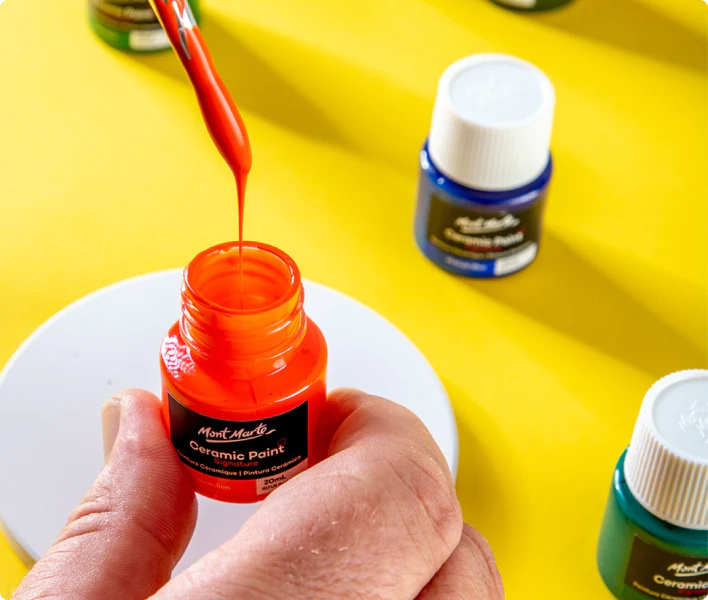
How to use ceramic paint on a thrifted plate

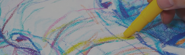
Cat drawing in pastel pencils

